Tuesday, 11 October 2016
analysis of magazine contents
int this magazine there are loads of topics that appeal to the target audience, some of the key themes and topics of each article are:
in the first article they have tweets from celebrities, the key theme of this article is for gossip, people love to find out stuff out about you tubers and spread it to other people who are not aware of it. another article in this magazine is a stand up to cancer article, where it has a famous youtuber Zoella wearing a stand up to cancer t-shirt. the key theme of this article is to bring people together to try and beat this disease. the magazine also contains a section where the audience get a say in what they want to see in the magazine, the theme of this article is improvement/ involving, this is effective because it allows the magazine editors and the audience communicate to help each other improve the magazine.
The contents of the magazine show the audience ways of life, or influences them into thinking the way they should live there life, they do this by showing the readers items of clothing or accessories that they are told are required in life. The magazine also shows the audience celebrity life styles, this is to inform and keep people up to date with there favourite celebs. the magazine basically inspires readers to be like the people in the magazine, to have the same life style as them and live similler lifes to the celebrities they are reading about. I believe that the magazine can some times give the wrong message that people need certain clothes and accessories to have a happy life but they are not true.
The magazine covers a lot of topics in the entirety of it, but there are 3 I believe shine more, showing the ideology behind the magazine. One of the main topics covered by the magazine is you tuber gossip. I identified this as one of the main topics of the magazine because it is practically the whole point of the magazine, also on page 4 it says 'juicy alfie goss' which shows us that this section of the magazine is dedicated to you tube gossip. Another key topic from the magazine is fashion/ style, the target audience that this magazine is aimed at revolves around fashion, so keeping them up to date with the latest fashion trends
The magazine contains articles that the target audience may find interesting. Many of the articles contain content that look at the life of celebrities, and up to date fashion.
Friday, 7 October 2016
editors letters review
this is the editors letters for one of the magazines i have been looking at. This editors letters has a lot of key contents, for example the letter has images and text which conveys a lot of the common things that people would see in an editors letter, for example, the editors writes to the audience as if they are a close friend, this is effective because it gives the audience a sense of a strong bond between the reader and the editor, another convention is that the paragraph is reasonably short and genuinely tells the reader the summary of the magazine, and there inspiration for some of the things inside the magazine. another key thing that the magazine includes is that he editor has signed her signature at the end of the letter this because it shows that he editors letter is very formal and actually aimed at the reader to read to and respond in their minds when they read the contents of the magazine.
Wednesday, 5 October 2016
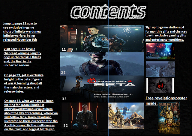
This is the contents page i included in my magazine, my contents page contains a lot of images, and text. this, contents page reflects my target audience because it includes lots of gaming images and text, and it reflects the genre witch is gaming. i believe the images drag the audiences attention to the contents page, because the images reflect whats on the front page and makes it easy for the audience to identify what content is in each page.
Tuesday, 4 October 2016
The magazines colour scheme consists of 5 different colours to represent different things. The main title consists of the colours red orange and yellow, the background is white, and the text is black. The colour scheme of the contents page is very basic and simple, i believe that this is meant to resemble the target audience, who are probably wealthy, upper class females aged 20-40, who focus there time on fashion.
The main image of the magazine is of a women standing on her own with a white background. he women is standing with a very slouched, but with confident body language. this has been used because it is a replacement for a main headline/ title. this is effective because it makes it easier for the reader to understand what is on certain pages, so seeing this women with the page number next to her will easily indicate to the reader that the article on that page will be about her or what she is wearing, based off the genre of the magazine.
The layout of the magazine is very well organised and neat. The main title is clearly labelled at the top, with the text at the left hand side and the main image on the right hand side of it. this was used because
Subscribe to:
Posts (Atom)