The target audience for the magazine "shout" is girls aged 9-12 who are into celebrity gossip, and girly websites, the reason i aimed it to girls around this age is because the language and colours of the magazine stand out to this age group, for example the word "shout" reflects the age stereotype of girls this age, that they always are loud and shout a lot, other reasons why this stands out to young girls is because of the images of the the front cover. the images on the cover are of stars, that stand out to the target audience, for example there on the cover there are pictures of Zoella, Shawn mendes and 5 seconds of summer, all of which are greatly admired and looked upon by the children of this target audience.
Loads of magazines now a days use colloquial and emotive language to attract target their target audience to there magazine, in shout some examples of emotive language are "love" and "angry." these words reflect 2 different emotions that readers the age the target audience is set to feel frequently, the connotations of the word "love" i can infer are: colours, like pink and red, which are both eye catching colours, that reflect the genre of the magazine, therefore making it appealing to the target audience.
Also colloquial language is used a lot in magazines these days, to make sure that they keep up to date with language and dialect spoken by the target audience, some examples of colloquial language in the magazine shout are "tell us grace f's fave.." this helps keep the target audience entertained and involved in the magazine,
Sunday, 22 January 2017
Friday, 20 January 2017
preliminary task- part 4 organised photo shoot
Tuesday, 13 December 2016
Preliminary task survey response graph
Friday, 2 December 2016
preliminary task part 3 student questionnaire
School magazine questionnaire
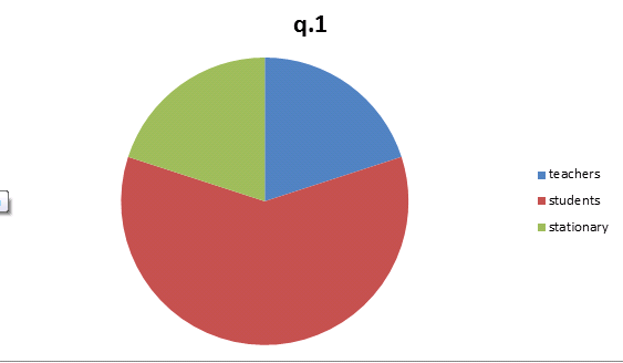
1.) what do you think would make an exceptionally good main image on the front cover of a school magazine?
teachers students school stationary
2.) how much would you be willing to pay for a school magazine?
prefer not to pay 50p £1 £1.50+
3.) Where would you expect to find a school magazine?
reception common room class room other
4.) how could you attract students from all different social/ ethnic groups?
5.) What would you most expect to see in a school magazine?
gossip academic progress revision advice other
6.) what sort of educational things would you expect to find inside a school magazine?
free stationary subject books articles from teachers
7.) How often would you expect a school magazine to be published?
daily weekly monthly
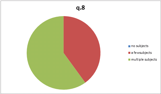
8.) what subject content would you expect to see in a magazine?
no subjects a few subjects multiple subjects
9.) Would you expect to see any branding or advertisements inside the school magazine?
yes no
10.) what do you think would be a suitable name for this schools?
magazine
Hampstead standard the pupils H-buzz
Friday, 25 November 2016
preliminary task part 2
Here is one idea for the design of a school/ magazine front cover i have have created.
Monday, 21 November 2016
Research-Representation and Genre Front Cover

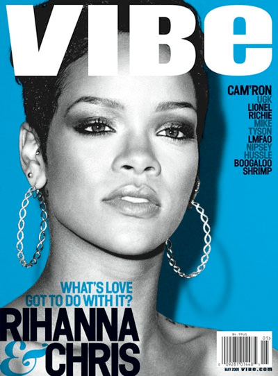
In the Vibe magazine, Rihanna is represented as strong but empty. Her strength is represented through her being the only image on the cover, taking up the majority of the cover, this shows she is important and dominant, the emptiness is represented through her being colourless in the cover, colour represents many different emotions, for example red can represent love or anger. but her being colourless exhibits to us that she has no emotion, maybe due to a past experience or event, but her being this big main image, shows she is trying to hide it by acting powerful. This is effective for the target audience because they feel as if they can relate to it, due to there own personal experiences. The target audience for this magazine is mainly teenage girls aged 12- 19 who have a passion for music and are fans of Rhianna, and also feel as if they can relate to what the magazine cover represents.
Another way how Rhianna is represented in the cover of Vibe magazine is as important. One way how this is shown is through verbal code, the verbal code consists of names of other artists, whereas Rhianna's is in big bold writing which out shines all the rest. The verbal code also mentions "love" above the artists name, which could resemble how she feels.
Genre-
The colour scheme of typical pop magazines is mainly more bright, vibrant colours, the colour scheme of this magazine is different though, although it still has the bright blue, the colourless image contrasts this showing a moor emotionless, less vibrant feel from the magazine. This links to representation because, the artist shown in the main image, Rhianna is portrayed as a strong important women by the camera work/ angle, but the colour scheme shows her is emotionless/ empty.
Planning-
I believe that when it comes to creating a magazine, genre and representation are very important, it give the magazine its own sense of identity, and makes the audience aware of what the magazines genre is. I will ensure to incorporate these in my own magazine cover to make it appealing to my target audience.
Friday, 18 November 2016
preliminary task- school magazine front covers
The main title of the magazine is the biggest and boldest piece of text on the magazine, this is to make it stand out, it is also bold to stand out, showing how important school is.
The main image of the magazine is effective because it makes the school seem fun, the image shows a girl smiling playing a stringed instrument, showing that the schools music course is very enjoyable for the students.
The magazines over all design is quite simple in theory, but complex in design, due to the amount of text, scattered in different parts of the magazine.
The colour scheme for the magazine consists of blue and white, which are very basic simple colours, they may be used because they are the colours of the school that publishes it, or it makes it seem more sophisticated to the reader.
Subscribe to:
Posts (Atom)