Tuesday 13 December 2016

Preliminary task survey response graph


Also in question 4 which was a written response on how to attract students from ethnic backgrounds and different social groups, the main response was to use diverse imagery of students feom different backgrounds on the cover.


Friday 2 December 2016

preliminary task part 3 student questionnaire

School magazine questionnaire  


1.) what do you think would make an exceptionally good main image on the front cover of a school magazine?

teachers                                students                                  school stationary


2.)   how much would you be willing to pay for a school magazine?


                                prefer not to pay       50p      £1        £1.50+


3.)  Where would you expect to find a school magazine?


 reception                             common room                                  class room                   other   


4.) how could you attract students from all different social/ ethnic groups? 


5.) What would you most expect to see in a school magazine?


      gossip           academic progress                 revision advice           other


6.) what sort of educational things would you expect to find inside a school magazine? 


     free stationary                 subject books              articles from teachers


7.) How often would you expect a school magazine to be published?


daily                                weekly                                monthly  


8.) what subject content would you expect to see in a magazine?


        no subjects         a few subjects                  multiple subjects  


9.)   Would you expect to see any branding or advertisements inside the school magazine?


             yes                                                                                no


10.)  what do you think would be a suitable name for this schools? 
  magazine


      Hampstead standard                  the pupils                                     H-buzz                                                                      


Friday 25 November 2016

preliminary task part 2

Here is one idea for the design of a school/ magazine front cover i have have created.
Here is another idea for the layout of a school/magazine front cover i have created 
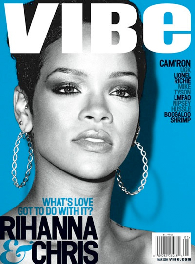
Monday 21 November 2016

Research-Representation and Genre Front Cover

Image result for  music magazine front cover

In the Vibe magazine, Rihanna is represented as strong but empty. Her strength is represented through her being the only image on the cover, taking up the majority of the cover, this shows she is important and dominant, the emptiness is represented through her being colourless in the cover, colour represents many different emotions, for example red can  represent love or anger. but her being colourless exhibits to us that she has no emotion, maybe due to a past experience or event, but her being this big main image, shows she is trying to hide it by acting powerful. This is effective for the target audience because they feel as if they can relate to it, due to there own personal experiences. The target audience for this magazine is mainly teenage girls aged 12- 19 who have a passion for music and are fans of Rhianna, and also feel as if they can relate to what the magazine cover represents.


Another way how Rhianna is represented in the cover of Vibe magazine is as important. One way how this is shown is through verbal code, the verbal code consists of names of other artists, whereas Rhianna's is in big bold writing which out shines all the rest. The verbal code also mentions "love" above the artists name, which could resemble how she feels.


Genre-

The colour scheme of typical pop magazines is mainly more bright, vibrant colours, the colour scheme of this magazine is different though, although it still has the bright blue, the colourless image contrasts this showing a moor emotionless, less vibrant feel from the magazine. This links to representation because, the artist shown in the main image, Rhianna is portrayed as a strong important women by the camera work/ angle, but the colour scheme shows her is emotionless/ empty.


Planning-

I believe that when it comes to creating a magazine, genre and representation are very important, it give the magazine its own sense of identity, and makes the audience aware of what the magazines genre is. I will ensure to incorporate these in my own magazine cover to make it appealing to my target audience.

Friday 18 November 2016

preliminary task- school magazine front covers


Image result for school magazines
The main title of the magazine is the biggest and boldest piece of text on the magazine, this is to make it stand out, it is also bold to stand out, showing how important school is.


The main image of the magazine is effective because it makes the school seem fun, the image shows a girl smiling playing a stringed instrument, showing that the schools music course is very enjoyable for the students. 


The magazines over all design is quite simple in theory, but complex in design, due to the amount of text, scattered in different parts of the magazine.


The colour scheme for the magazine consists of blue and white, which are very basic simple colours, they may be used because they are the colours of the school that publishes it, or it makes it seem more sophisticated to the reader.


Image result for school magazines


Monday 14 November 2016

Research- Music Magazine Front Cover Analysis

Image result for music magazine cover ed sheeran
In the front cover for fabulous Ed Sheeran is represented as a successful "ladysman". One way this is established is through the use of verbal code, the text says "from sofa surfing to sleeping with superstars." This indicates to the audience that the artist has had a very rough and hard life, not having an an actual home, prior to becoming a famous singer, and now due to his hard work he has become a successful man, who sleeps with many famous superstars now. This is intriguing to the audience because, a new artist has just popped up, become very successful, then they find out he was a "sofa suffer" the use of words makes the audience want to read more.   


Another way that Ed Sheeran is represented as a lady's man is by the main image. The main image displays our artist Ed Sheeran in mid-shot with his head looking down, and his eyes looking at the camera, with him having a smug facial expression, with a woman's hand touching his face. This is used to hint us that the artist has slept with a lot of women, they chose to only show the audience the woman's arm so that she doesn't have an identity, meaning this arm could belong to multiple different people. The reason that the picture has been taking like that is to inspire the audience, the audience for the magazine is boys and girls from teenagers age 14 all the way to young adults, 25. The values of the audience, from this magazine i can tell are the value of greatness from small begging's, he was a young no body but persevered through and reached the top, which inspires the target audience. The way that  Ed's head is tilted and he is looking towards the audience, is communicating to the audience, reaching out to them giving them different messages, it could make female readers think, could they be the next unidentified arm? or make men want to be like him, thinking they could be the next big successful hot shot sleeping with multiple different women all the time, wearing expensive classy clothes. The white background is used to outline and make the artist stand out even more the magazine itself, because hes such a "hot topic."


Another way that Ed Sheeran is represented as successful is through his dress sense. the main image displays him wearing a purple, silky suit. The material of the suit tells to us that he he successful because the material the suit is made of silk, which can be quite expensive, but him wearing it shows that is not for him. the connotations of the word silk i can interpret are soft, this could link to his personality or feelings/ memories he has from his old life when he was with out a home, he will have a "soft" spot for it remembering that it was his origins. Also the connotations from the colour purple i can get are gentle but powerful, this again represent the artists personality, showing he is a gentle, kind man, but is powerful in his world of business. This becomes appealing to the audience because, they may also believe in what the colour represent an inspires them to realise, what the artist has been through, and quite possibly relate to him.    


planning
From doing this task today it has helped me to realise that the main image of a magazine is very important for relating/ attracting the target audience, and will take into consideration facial expressions and shot types in my own magazine cover. Also other things like verbal code are also important. I have learnt that the stereotypical representation isn't always the same, witch has been showed in this magazine cover, i will make sure not to follow the stereotypes in my own magazine.  


Tuesday 11 October 2016

analysis of magazine contents

Displaying IMG_9596.JPG


int this magazine there are loads of topics that appeal to the target audience, some of the key themes and topics of each article are:
in the first article they have tweets from celebrities, the key theme of this article is for gossip, people love to find out stuff out about you tubers and spread it to other people who are not aware of it. another article in this magazine is a stand up to cancer article, where it has a famous youtuber Zoella wearing a stand up to cancer t-shirt. the key theme of this article is to bring people together to try and beat this disease.  the magazine also contains a section where the audience get a say in what they want to see in the magazine, the theme of this article is improvement/ involving, this is effective because it allows the magazine editors and the audience communicate to help each other improve the magazine.


The contents of the magazine show the audience ways of life, or influences them into thinking the way they should live there life, they do this by showing the readers items of clothing or accessories that they are told are required in life. The magazine also shows the audience celebrity life styles, this is to inform and keep people  up to date with there favourite celebs. the magazine basically inspires readers to be like the people in the magazine, to have the same life style as them and live similler lifes  to the celebrities they are reading about. I believe that the magazine can some times give the wrong message that people need certain clothes and accessories to have a happy life but they are not true.


The magazine covers a lot of topics in the entirety of it, but there are 3 I believe shine more, showing the ideology behind the magazine. One of the main topics covered by the magazine is you tuber gossip. I identified this as one of the main topics of the magazine because it is practically the whole point of the magazine, also on  page 4 it says 'juicy alfie goss' which shows us that this section of the magazine is dedicated to you tube gossip. Another key topic from the magazine is fashion/ style, the target audience that this magazine is aimed at revolves around fashion, so keeping them up to date with the latest fashion trends


The magazine contains articles that the target audience may find interesting. Many of the articles contain content that look at the life of celebrities, and up to date fashion.


Friday 7 October 2016

editors letters review


this is the editors letters for one of the magazines i have been looking at. This editors letters has a lot of key contents, for example the letter has images and text which conveys a lot of the common things that people would see in an editors letter, for example, the editors writes to the audience as if they are a close friend, this is effective because it gives the audience a sense of a strong bond between the reader and the editor, another convention is that the paragraph is reasonably short and genuinely tells the reader the summary of the magazine, and there inspiration for some of the things inside the magazine. another key thing that the magazine includes is  that he editor has signed her signature at the end of the letter this because it shows that he editors letter is very formal and actually aimed at the reader to read to and respond in their minds when they read the contents of the magazine.


Wednesday 5 October 2016

This is the contents page i included in my magazine, my contents page contains a lot of images, and text. this, contents page reflects my target audience because it includes lots of gaming images and text, and it reflects the genre witch is gaming. i believe the images drag the audiences attention to the contents page, because the images reflect whats on the front page and makes it easy for the audience to identify what content is in each page. 

Tuesday 4 October 2016

Image result for magazine contents page


The magazines colour scheme consists of 5 different colours to represent different things. The main title consists of the colours red orange and yellow, the background is white, and the text is black. The colour scheme of the contents page is very basic and simple, i believe that this is meant to resemble the target audience, who are probably wealthy, upper class females aged 20-40, who focus there time on fashion.

The main image of the magazine is of a women standing on her own with a white background. he women is standing with a very slouched, but with confident body language. this has been used because it is a replacement for a main headline/ title. this is effective because it makes it easier for the reader to understand what is on certain pages, so seeing this women with the page number next to her will easily indicate to the reader that the article on that page will be about her or what she is wearing, based off the genre of the magazine.


The layout of the magazine is very well organised and neat. The main title is clearly labelled at the top, with the text at the left hand side and the main image on the right hand side of it. this was used because
  

Monday 3 October 2016

this is generations sp4 official magazine cover, the genre of this magazine is gaming, the target audience for this magazine is teenager boys who like gaming.

Friday 16 September 2016

Conventional layout of a magazine cover


Image result for magazine coversImage result for magazine coversImage result for magazine covers

  Rolling Stone
Empire
Cosmopolitan
Image
the main image is a close up of a famous music artist, the image takes up the majority of the front cover. 
the main image is of 2 of the main characters from the new star wars film, it takes up the whole cover. 
The main image of this magazine cover is of an iconic female music artist, wearing revealing clothing and standing in a sexual/ seductive pose, tis is to attract a male audience to the magazine and also fans of this iconic music artist. 
Coverlines
they are positioned on the right hand side of the cover in a lower font so that the readers whole attention is on the main cover lines. 
this magazine has not got any cover lines to show off the characters on the main character, if it did have them they would be positioned on the sides of the cover  
There are many cover lines on this magazine cover, in different colours, mainly white, but all of them are mainly consisted about sex and how to keep your body looking good, telling women how society thinks they should look like. 
Title
the main title is positioned at the top of the magazine cover over the main image.  
the title is positioned at the top of the magazine in a bold red font, behind the main image, because the magazine is so well known they don't need to tel the reader the title. 
The main image of this magazine cover is at the top of the magazine, in different colours, pink, white and blue, these attract the audiences eye. The title is covered by the main image, showing that the magazine is so popular that people dont need to see the title to know what magazie that is, also so that the audience focuses more on the main image and articles instead of the brand of magazine. 
Tagline
this magazine does not have a tagline, however if it did it would probably be positioned beneath the main title and wouldn't be that big 

the main one is positioned on the left hand side in a big bold font to show the reader 


This issue of the magazine does not have a tagline, however other issues may have and the majority of the time it is located near the title. 
Price
the magazine doesn't show a price it shows the bar code, however if it did show the price it would be positioned in a corner of the magazine and visible to the buyer 
The magazine does not show the price on the main cover page, however if it did it would be located in one of the corners of the magazine cover with a different colour to the main colour scheme making it stand out to the audience 
The price of this magazine is in the top right corner of the magazine, in a bright yellow box, however it is really small so that the readers cant see the price properly and will pay for it.
Date
it does not show the date of the magazine, it would be somewhere near the bottom of the cover if it was included 
Main Coverlines
The main cover line in this magazine is in a bigger bolder font compared to the rest of the text on the cover, indicating to the audience that that is the main topic of the magazine. This magazine is different apart from the title the only other text on the magazine is the name of the film star wars the force awakens, which could be seen as the main cover line to the audience because of its big font. This magazine covers main cover line is wild summer sex, the word sex is in a brighter bolder font compared to the rest of the magazine cover, this is because this generation lots of people like to sexuallise women, a good example of this is the magazines main image, showing a women looking in terms "sexy" with the word sex in bright bold colours and fonts is meant to idolise this to the audience, they see a women looking like hoe nikki minaj is in this picture with th word sex next to her will make the male part of the audience buy this magazine to look more over what the magazne is trying to convey putting this main image and this main cover line together. 
T

Friday 9 September 2016


main image 

One of the main features to this magazine is the main image. the main image shows David Beckham, who is an iconic football player, his image takes up over half of the magazine cover. The effect of this is that fans of this magazine, or the target audience, the position of him in the image is effective as well. The image is a mid shot of David Beckham, standing with his body sideways with his head looking towards the camera. This is effective because the readers will see him looking towards him, which makes them want to buy it because it has caught their eyes/ attention. The image also shows that he is a sporty person, by the genre of the magazine, and his dress code, his dress code looks like the top half of a tracksuit with a plane white shirt, showing the reader he is a sporty person. People can be inspired by this magazine, they will see David and see how athletic it is and people will want to be like him because he is a world famous idol.

title


Another main feature of this magazine is the title, the title is called men's health, which is in a bright vibrant orange. the reason why the title is in this colour is because its eye catching to the reader, it stands out on a shelf. the target audience of this magazine is men who want to keep fit and healthy, this is easily shown to us through the title, the title tells us that this magazine is specifically for men. also, linking to the main image the title is covered by the main image, this is effective because the magazine is so famous and well known that they can have this iconic sports star covering their title, so it basis the whole magazine on him, and doesn't focus on who produced the magazine.

colour


Another main feature of this magazine cover is the colour scheme. the colour scheme for this magazine is very basic consisting of the colours: white, black, red, grey, and orange. these colours are basic because, they have to make the image stand out, so by using these plain simple blacks and whites, bring out the brightly coloured red in the main image. the colour scheme could represent the target the audience, the colour scheme is very ordinary with little bursts of colour, this could represent someone doing exercise, seeing as this magazine is based on being fit and healthy, the ordinary colours could represent a gentle normal work out, then the burst of bright colours could represent a higher intensity work out, which is short and energetic. 

language

the language in this magazine cover is very reflective on the genre magazine. the text tells the reader about the the ways to look good and smell good, after and during exercise. this attracts the reader because the audience that the reader is part off is interested in this stuff. in a way its inspiring men to keep themselves to keep in shape.

cover line

The main cover line of this magazine is hard to see in this, because there is so many. I think that they have done this because they want to make every part of the magazine important and worth reading to the audience. They are positioned all over the magazine in big bold writing, so that they can catch the readers eye/ attention. the colour scheme for all of them is black.